I’ve been wanting a way to show the world’s sea ice area changes in an intuitive and engaging manner. There doesn’t seem to be any way of logically coming up with something like that. No process to go from data to visual that you can rely on. I didn’t sit down with a piece of paper and step through some sort of algorithm, and out popped the barrel graph:
Global, Arctic, and Antarctic sea ice area barrel November 2019https://t.co/cZNU94d632#GlobalWarming #ClimateChange pic.twitter.com/CRUOciRHcU
— ⚫️ Kevin Pluck (@kevpluck) December 1, 2019
I went for a run and was mulling over repeated annual data going in loops and how the spiral graph was distorted as the ice area was reducing creating cartiod shapes:

Cartiod shapes form when the radius of a sinusoidal plotted using polar coordinates approaches 0. Image source: The University of Georigia
The shapes are beautiful but unfortunately difficult to interpret and distracting. More mulling and running, and then my mind wandered around other forms of data displays that deal with cyclical data. One that popped out was seismic drums:
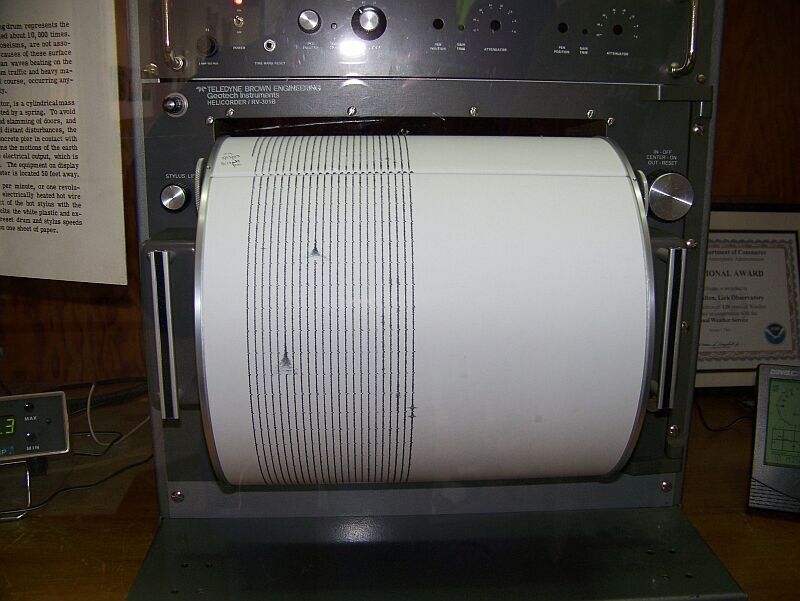
Seismic drum at the Lick Observatory, University of California. Image source: Judy Volker
The drum itself isn’t a good form of data display, merely a way of recording continuous data in a compact form, but it inspired me to come up with the barrel graph!
So, going for a run and mulling over stuff is the algorithm you can apply to come up with new forms of data visuals. Not hard, eh?
But I still wasn’t satisfied, as the barrel graph still takes a bit of interpretation because it’s not entirely obvious what is going on with the rings for the Arctic and the Antarctic and that the top ring is their total. So I’ll just go for a run and mull things over, and something better will come of it!
Right?
Just last week I was sat on the sofa and thinking about circles. Then this popped into my brain, and I made it that very evening:
Arctic Sea Ice Area 1980-2018https://t.co/cZNU94d632#GlobalWarming #ClimateChange pic.twitter.com/fvgK8ufxSj
— ⚫️ Kevin Pluck (@kevpluck) December 1, 2019
No running or mulling. Just a sofa and sitting. If I’d known that, I could’ve saved a lot on trainers!